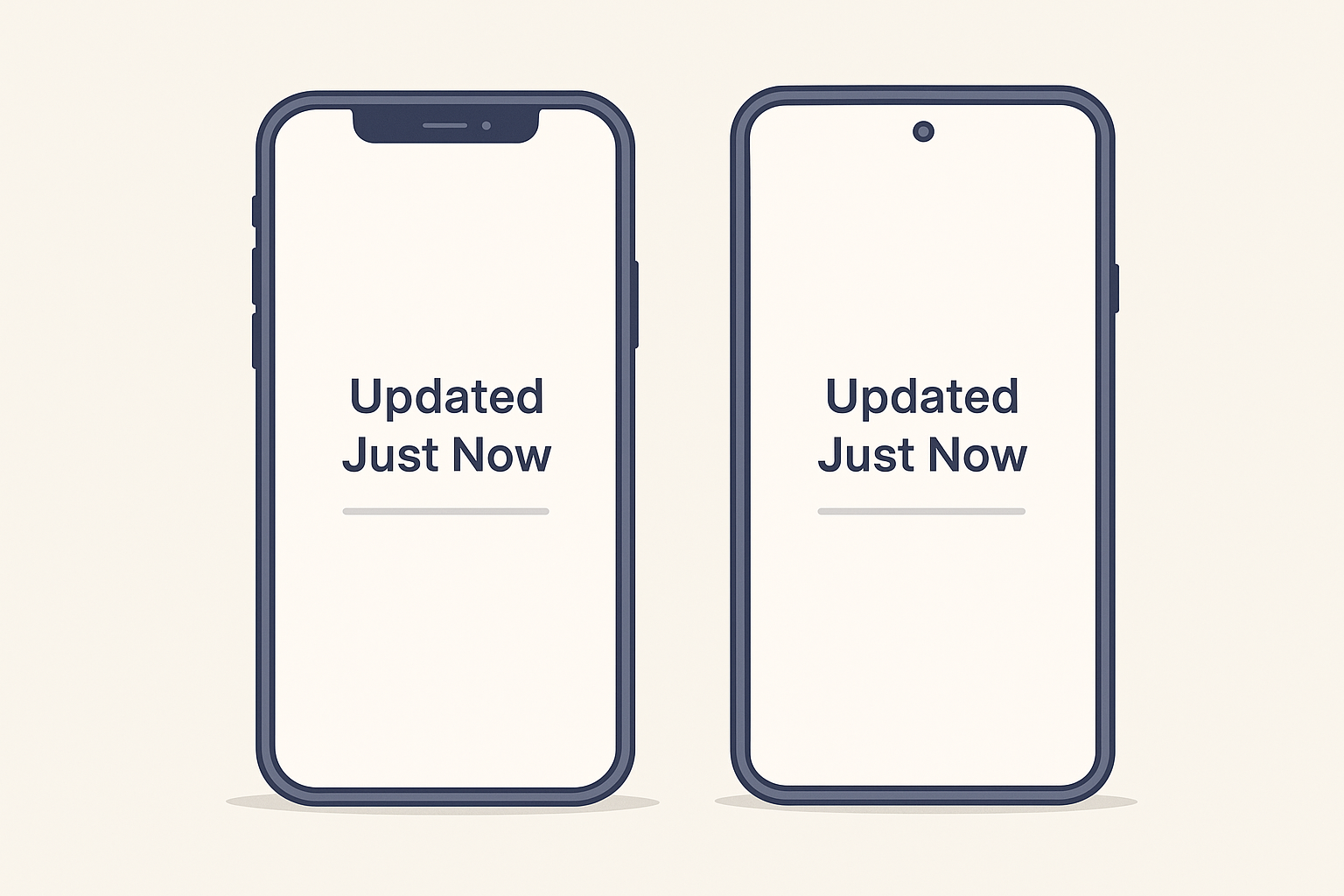
Updated Just Now
Mailtemi’s sync system has worked reliably for a long time. The part that took more effort was presenting the progress in the UI. iOS and Android each had their own code for showing loading states, handling errors, and dealing with timers. It worked fine, but it meant touching everything twice and sometimes missing small edge cases because the two implementations drifted apart.
This update simplifies that. Both platforms now show the same sync status, driven directly by the backend. The UI no longer tries to interpret anything — it only displays the values it receives.
A Single Line of Text
The sync state is now shown as a small, unobtrusive line that appears in two places:
- At the top of the inbox, just under the search bar
- As secondary navigation text, inside the navigation bar itself when the user scrolls
This keeps the sync information visible even when browsing long lists of messages or switching between screens. It behaves like a natural part of the UI rather than a separate component.
Examples:
-
“Updated Just Now”
Displayed directly in the navigation bar during scrolling, so the user always knows the last sync state without needing to scroll back to the top. -
“Updating…”
A subtle text-based dots animation replaces platform-specific spinners. It fits neatly into the subtitle space without distracting from content. -
“2 of 3 accounts synchronized.”
Provides a clear summary when an account requires attention. The wording is kept short to work well in compact navigation areas. -
If synchronization doesn’t complete because of throttling or network issues, the line simply doesn’t change to “Updated Just Now”, avoiding unnecessary alerts while still being informative.
By integrating the sync line into the navigation bar, the UI stays consistent across inbox, contacts, and other sections, and remains readable even during fast scrolling.

Why “Updating…” Sometimes Takes a Bit Longer
A pull-to-refresh gesture does more than just check for new mail.
To ensure consistency across accounts and servers, the backend performs a full refresh of flags such as:
- Unread
- Flagged
- Deleted / moved
- Any other state that must remain aligned with the server
This extra validation ensures the app reflects accurate server state, even for accounts with irregular or delayed updates.
It adds a small delay, but it prevents drifting or mismatched message states.
Less Duplicate Work
Moving sync reporting fully to the backend removes:
- Two separate error-reporting paths
- Two versions of “sync in progress” UI
- Platform-specific timeout logic
- Extra platform-specific testing
The change doesn’t alter how Mailtemi syncs — it simply reduces maintenance. As a solo developer, having one place to update instead of two frees time for building new features instead of maintaining duplicate UI logic.
Future Ideas
The current sync line is intentionally simple. The backend already supports more expressive states that can be enabled later, such as:
- Refreshing older messages…
- Reconnecting…
- Waiting (server throttle)
- Retrying in 15s…
- Updated 1 hour ago — battery saver active
These will be introduced gradually as the sync experience continues to evolve.
Ready for More Platforms Later
The unified text-based sync line adapts easily to upcoming environments:
- GTK / GNOME on Linux — minimal, content-focused design where subtle indicators fit naturally
- TUI — one line of text is ideal for terminal-based interfaces
This approach allows Mailtemi’s sync UX to stay consistent across platforms without redesigning core behavior.
Closing
The unified sync line doesn’t change how Mailtemi syncs email. It simply makes the presentation lighter, more consistent, and easier to maintain. Small changes like this help free up time for the larger features ahead.